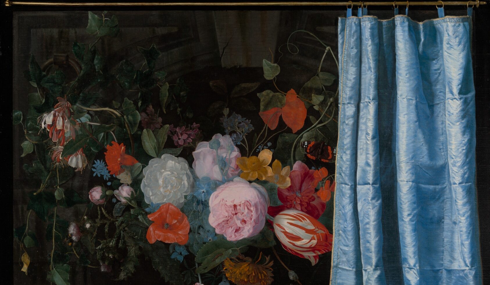
Trompe-l’Oeil Still Life with a Flower Garland and a Curtain (1658) by Adriaen van der Spelt and Frans van Mieris is not only a stunning piece of art—it’s also a deception. Van der Spelt’s detailed floral garland captures the viewer’s attention, while Van Mieris’ blue curtain tricks the viewer into thinking it could be pulled aside.
When does design cross the line into deception?
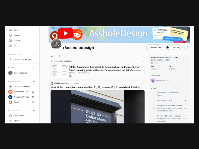
r/AssholeDesign is a subreddit where users share examples of poor design choices that frustrate users. It’s a fun yet critical look at design fails, from confusing interfaces to illogical user flows.
I might be spending a bit too much time on r/assholedesign. If you haven’t seen it, it’s a subreddit where users share frustrating design choices, like interfaces that trick, confuse, or mislead. Some are simply bad design; others are intentional manipulations that prioritize business objectives over user clarity.
“Asshole design” is surprisingly easy to spot. It refers to design strategies that feel almost hostile, tricking users into clicking buttons they don’t intend to, making cancellation processes difficult, or creating misleading UI elements to drive engagement. These deceptive tactics, often called dark patterns, are designed to manipulate user attention, perception and behavior, leading users to unintended actions.
A Framework for Detecting Deceptive Patterns
Reflecting on these patterns, I’ve started working on an evaluation matrix called Is This Design Deceptive?. It helps identify when a design might be crossing into deceptive territory, offering a structured framework to recognize and address tactics that prioritize business goals at the expense of user well-being.
Some key areas the framework evaluates include:
- False Urgency & Social Proof Manipulation: Are users pressured into decisions with countdown timers or inflated popularity metrics?
- Attention Manipulation: Does the design use infinite scroll, autoplay, or excessive notifications to hold attention unnecessarily?
- Misleading Visuals & Language: Are graphics or CTAs deceptive about the product or action?
- Subscription Traps & Hidden Costs: Does the interface make canceling difficult or reveal fees only at checkout?
- Privacy & Control: Are privacy settings deliberately complicated, or are users nudged into sharing more than they intended?
Ultimately, good design isn’t just about usability, it’s about ethics. As designers, we shape experiences, and we have a responsibility to ensure they serve users, not exploit them. Instead of designing to trap attention, what if we focused on fostering trust, clarity, and autonomy?
Interested in trying out the Is This Design Deceptive? framework? Let me know your thoughts!
Maybe the best design isn’t the one that keeps people engaged at all costs, but the one that respects their time, choices, and well-being.
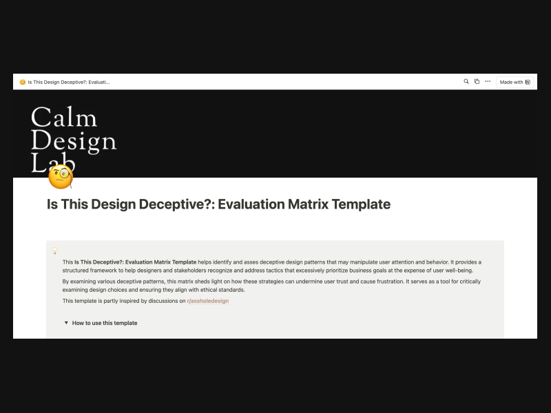
The Is This Design Deceptive? template helps identify and asses deceptive design patterns that may manipulate user attention and behavior. It provides a structured framework to help designers and stakeholders recognize and address tactics that excessively prioritize business goals at the expense of user well-being.

detail of Trompe-l’Oeil Still Life with a Flower Garland and a Curtain (1658).